
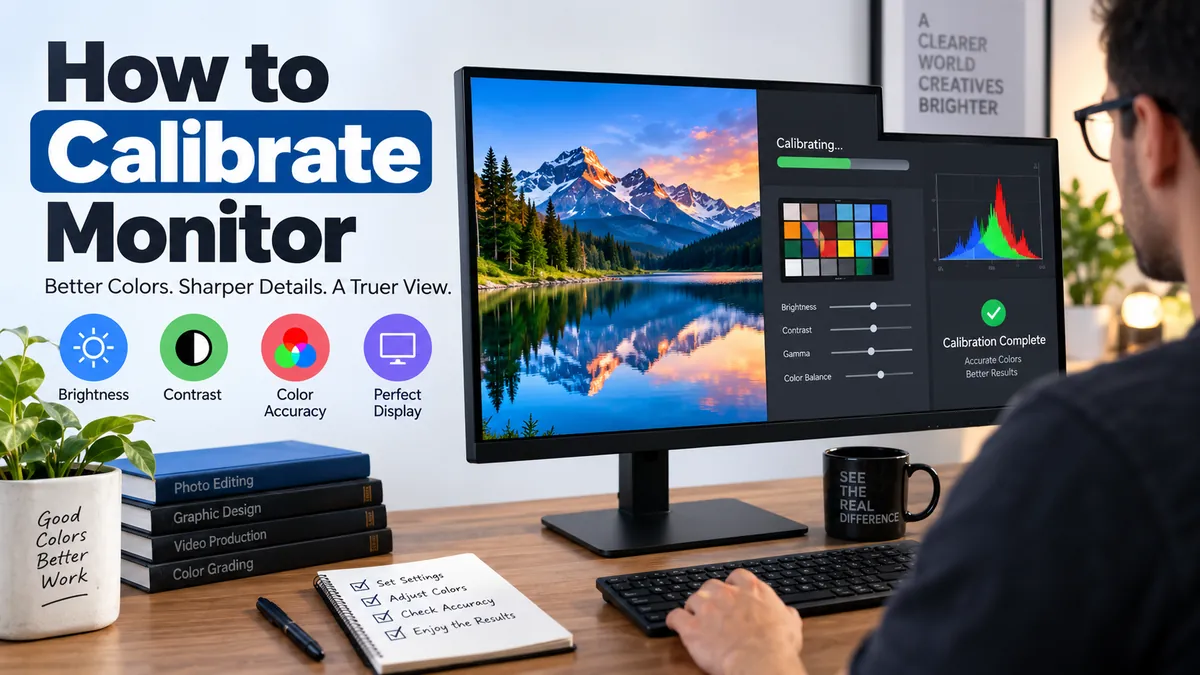

A monitor can look perfectly fine and still display inaccurate colors. Whites may lean blue, shadows may lose detail, skin tones can look unnatural, and photos that look great on your screen may appear completely different on another display or in print.
Learning how to calibrate monitor settings fixes many of these problems. You can perform a useful basic calibration with built-in operating-system tools, while photographers, designers, and video editors can achieve much greater accuracy with a hardware colorimeter.
Monitor calibration adjusts brightness, contrast, gamma, white point, and color response so your display produces a more accurate and consistent image. For everyday use, built-in Windows or macOS calibration tools are usually sufficient. For color-critical photography, design, printing, or video work, use a hardware calibration device to measure the display and create an ICC color profile.
Why Monitor Calibration Matters
Every monitor produces color differently. Two displays showing the same photograph can have noticeably different brightness, contrast, saturation, and white balance.
These differences come from several factors:
- Panel and backlight technology
- Factory calibration
- Display age
- Brightness settings
- Color temperature
- Viewing angle
- Ambient room lighting
- Operating-system color management
- Selected color mode
- HDR or SDR configuration
Even newer monitors are not automatically accurate enough for every task. Datacolor notes that color-critical image and video work can still require sensor-based calibration despite improvements in modern displays.
Calibration becomes particularly useful when you’re editing photographs, preparing graphics for printing, color grading video, working with multiple monitors, or simply noticing that colors look wrong.
For ordinary browsing, office work, gaming, and streaming, you usually don’t need laboratory-level accuracy. Apple, for example, says display calibration is generally unnecessary for Macs used in typical home or office environments.
Calibration vs. profiling
These terms are often used interchangeably, but technically they describe related processes.
Calibration brings the display toward defined targets such as brightness, gamma, and white point.
Profiling measures how the calibrated display actually reproduces colors and records those characteristics in an ICC profile. Color-managed applications can then use that profile to render colors more accurately.
Hardware calibration systems generally perform both processes as part of the same workflow.
How to Calibrate Monitor Settings Before You Start
Don’t begin calibration immediately after switching on the monitor. Preparing the display and room first makes the result more reliable.
1. Let the monitor stabilize
Allow the display to reach its normal operating condition before performing precision calibration. The exact warm-up requirement varies by monitor technology and manufacturer, so follow the documentation for your display when color accuracy is critical.
2. Use your normal room lighting
Calibrate under the lighting conditions in which you normally use the monitor.
Ambient light changes how your eyes perceive brightness and color. Apple specifically identifies ambient lighting, display position, viewing angle, and display age as factors that affect color perception.
Avoid having strong sunlight directly hit the screen. For professional color work, stable room lighting is much better than a workspace that changes dramatically throughout the day.
3. Clean the screen
Dust, fingerprints, and smudges can interfere with visual judgment and potentially affect a measurement device placed against the screen.
Use an appropriate display-cleaning method recommended by your monitor manufacturer.
4. Disable image-enhancement features
For accurate SDR calibration, turn off unnecessary processing such as:
- Dynamic contrast
- Automatic brightness
- Blue-light or eye-care modes
- Night Light
- True Tone when inappropriate for the workflow
- Eco modes that change brightness
- Game-specific color enhancement
- Artificial sharpening
- Dynamic color or saturation enhancement
The objective is to create a stable baseline rather than a display whose appearance changes according to content or environmental conditions.
Microsoft similarly warns that HDR calibration may not work as expected when a display has post-processing effects enabled.
5. Choose an appropriate monitor preset
If your monitor provides several picture modes, start with a neutral or color-accurate preset.
Common choices include:
| Display mode | Typical use |
|---|---|
| Standard | General computing |
| sRGB | Web, general photography and SDR content |
| Adobe RGB | Wide-gamut photography and print workflows |
| DCI-P3/P3 | Wide-gamut creative and video workflows |
| HDR | HDR movies, games and HDR production |
| Gaming modes | Gaming rather than color-critical editing |
Avoid choosing a wide-gamut mode simply because it sounds better. Your workflow, software, monitor, and color-management setup should determine the appropriate color space.
how to calibrate monitor Manually
If you don’t own a colorimeter, you can still make meaningful improvements manually.
The basic process is:
- Reset inappropriate picture enhancements.
- Set the monitor to an appropriate color preset.
- Adjust brightness for your environment.
- Set black and white levels correctly.
- Adjust gamma.
- Set a neutral white point.
- Check grayscale and color balance.
- Save or select the resulting color profile.
- Verify the result using familiar test images.
Here’s what each adjustment actually does.
Set brightness correctly
One of the most common calibration mistakes is using a monitor that is far too bright.
High brightness may make photographs look impressive on screen, but it can cause editing problems. If you edit a photograph while looking at an excessively bright display, you may darken the image unnecessarily. A resulting print can then look darker than expected.
There isn’t one perfect brightness value for every room.
Brightness should make sense relative to the lighting around the display. Datacolor likewise recommends choosing display brightness in relation to workplace illumination rather than treating brightness as an isolated setting.
A professional calibration application may express brightness as luminance in cd/m², also called nits. Targets around 100–120 cd/m² are frequently encountered in controlled SDR creative workflows, but your appropriate target depends on the room and intended output.
Adjust contrast
Contrast determines the relationship between darker and brighter tones.
Too much contrast can clip highlights, causing different bright shades to merge into plain white. Incorrect black-level settings can similarly destroy shadow detail.
Use a grayscale or black-and-white test pattern. You should be able to distinguish near-black and near-white steps without making the image look washed out.
On many modern LCD and OLED displays, leaving the contrast control near its appropriate default is preferable to aggressively changing it without measurement.
Set gamma
Gamma controls how midtones are represented between black and white.
For standard PC, web, and general color-managed workflows, gamma 2.2 is a widely used target. Datacolor identifies 2.2 as the common setting associated with sRGB/Adobe RGB and modern Windows/macOS workflows.
If gamma is incorrect, an image can look too dark or washed out even when its black and white points seem reasonable.
Set the white point
The white point determines what the monitor considers neutral white.
A common target for general computer use, sRGB, photography, and many creative workflows is approximately 6500 K, associated with D65. Datacolor recommends 6500 K as a target for common sRGB and Adobe RGB workflows.
A lower color temperature appears warmer or more yellow. A higher temperature looks cooler or bluer.
Some monitors provide individual RGB gain controls. With measurement hardware, these can be adjusted to bring the display’s native white point closer to the calibration target before software corrections are applied.
Check color saturation
Don’t increase saturation just because the screen looks more impressive.
An oversaturated display makes editing decisions unreliable. Photographs adjusted on that monitor may appear dull elsewhere because you unknowingly compensated for exaggerated monitor colors.
The goal of calibration is predictable reproduction, not maximum visual impact.
How to Calibrate a Monitor in Windows 11
Windows provides display and color-management controls that can improve a monitor without purchasing additional equipment.
Before calibrating an external display, use its physical buttons or OSD (On-Screen Display) to establish sensible brightness, contrast, and picture-mode settings. Microsoft notes that external-monitor brightness often needs to be changed using the monitor’s own controls rather than the Windows brightness slider.
For SDR calibration, search Windows for Calibrate display color and launch the display color calibration workflow when available.
The wizard guides you through visual adjustments involving gamma, brightness, contrast, and color balance.
When working with multiple monitors, make sure you’re calibrating the correct display.
Windows color profiles
Windows uses color profiles to describe how a display reproduces color.
After calibration, check your display’s profile through Windows color-management settings. A correct profile becomes especially important when you use color-managed applications for photography, graphics, or printing.
Avoid randomly downloading an ICC profile created for somebody else’s monitor and assuming it will perfectly calibrate yours.
Even two units of the same model can differ because of manufacturing variation, panel age, brightness, and environmental conditions. A manufacturer-supplied profile can provide useful characterization, but an individually measured profile is preferable when high accuracy matters.
How to Calibrate an HDR Monitor in Windows 11
HDR requires a different approach from ordinary SDR calibration.
If your display supports HDR10, Windows 11 provides the Windows HDR Calibration app. Microsoft says it uses three test patterns based on recommendations from the HDR Gaming Interest Group (HGIG). The patterns determine the darkest visible detail, brightest visible detail, and maximum display brightness.
To calibrate HDR:
- Open Settings > System > Display > HDR.
- Select the HDR-capable monitor if multiple displays are connected.
- Turn HDR on.
- Install and open Windows HDR Calibration.
- Move the calibration window to the HDR display.
- Run it full screen.
- Follow the darkest-visible-detail test.
- Complete the maximum-luminance tests.
- Adjust color saturation carefully.
- Save the generated profile.
Microsoft advises calibrating under the lighting conditions in which you normally use the display and warns against excessive saturation because it can make HDR content look unnatural.
Windows also provides an SDR/HDR content brightness adjustment because the same display can interpret SDR and HDR signals differently.
SDR and HDR calibration aren’t interchangeable
This distinction matters.
SDR (Standard Dynamic Range) and HDR (High Dynamic Range) use different brightness and dynamic-range expectations. A display that looks correct in SDR won’t necessarily have properly configured HDR highlights and shadow detail.
If you regularly switch between SDR creative work and HDR gaming or video, treat them as separate viewing conditions.
How to Calibrate a Monitor on Mac
macOS includes color-management and calibration capabilities, although the available options depend on the Mac and display.
For supported displays, Apple provides Display Calibrator Assistant.
Apple’s current procedure is:
- Open the Apple menu.
- Choose System Settings.
- Select Displays.
- Open the menu beside Color profile.
- Choose Customize.
- Click the Add (+) button.
- Follow Display Calibrator Assistant.
- Complete the adjustments.
- Save the calibrated profile.
The resulting profile is automatically assigned as the display’s color profile.
Certain Apple displays use different calibration capabilities. Apple specifically distinguishes products such as Pro Display XDR, Studio Display, and newer 14-inch and 16-inch MacBook Pro displays, directing applicable users toward its Pro Display calibration workflow.
For everyday Mac use, manually changing a well-configured factory profile isn’t automatically an improvement. Only alter settings when you understand the workflow requirement or have a genuine color-consistency problem.
How to Calibrate Monitor With a Colorimeter
Visual calibration has a fundamental limitation: your eyes are the measuring instrument.
Human vision adapts surprisingly quickly. If you stare at a slightly blue display for long enough, it can begin to look normal. That’s one reason hardware measurement is preferred for professional color work.
A colorimeter physically measures light and color produced by the monitor.
Common calibration systems include devices from Calibrite and Datacolor Spyder. Depending on the product and software, they can measure the display and generate an ICC profile tailored to that particular monitor.
Datacolor describes its calibration process as displaying known color patches, measuring them with the sensor, returning those measurements to the software, and using the results to calculate display corrections.
Typical hardware calibration process
- Install the calibration software.
- Connect the colorimeter by USB.
- Choose the correct display technology.
- Select the monitor you want to calibrate.
- Choose the desired color-space/workflow settings.
- Set the target gamma.
- Choose the white point.
- Select an appropriate luminance target.
- Place the sensor flat against the screen.
- Allow the software to display and measure color patches.
- Make requested hardware adjustments.
- Let the software complete its measurements.
- Create the ICC profile.
- Assign that profile to the display.
- Verify the calibration.
Selecting the correct panel or backlight technology can matter. For example, current Datacolor software distinguishes standard-gamut LED displays from wide-gamut LED technologies and other display types so measurements can be handled appropriately.
Manual Calibration vs. Hardware Calibration
The right method depends on what you’re doing.
| Feature | Manual calibration | Hardware calibration |
|---|---|---|
| Cost | Free | Requires a measurement device |
| Ease | Easy | Moderate |
| Brightness adjustment | Visual | Measured |
| White-point accuracy | Approximate | Measured |
| Gamma correction | Visual/software | Sensor-based |
| ICC profiling | Limited/system dependent | Custom measured profile |
| General office use | Usually sufficient | Usually unnecessary |
| Gaming | Usually sufficient | Optional |
| Photography | Basic | Recommended for serious work |
| Graphic design | Basic | Recommended |
| Print matching | Limited | Strongly recommended |
| Video color work | Limited | Recommended |
| Multi-monitor consistency | Difficult | Much better |
If your only concern is making a home monitor look balanced, start with the free tools.
If your income or final output depends on accurate color, measurement hardware is a much more reliable approach.
Best Monitor Calibration Settings
There is no universal combination of settings that works perfectly for every display, room, and workflow.
Still, these are useful starting points for conventional SDR work:
| Setting | Common starting point |
|---|---|
| Color space | sRGB for general/web SDR work |
| Gamma | 2.2 |
| White point | D65 / approximately 6500 K |
| Brightness | Match room and output conditions |
| Contrast | Avoid black/highlight clipping |
| Dynamic contrast | Off for calibration |
| Night/blue-light mode | Off during color work |
| HDR | Off when calibrating an SDR workflow |
| ICC profile | Profile created for the actual display |
Treat these as targets rather than magic numbers.
For example, a photographer preparing images for print in a controlled studio may use different luminance requirements from somebody editing web graphics in a brightly lit office.
The intended output matters.
sRGB, Adobe RGB, and DCI-P3 Explained
Monitor calibration often becomes confusing because calibration gets mixed up with color gamut.
They aren’t the same thing.
sRGB
sRGB is widely used for web content and ordinary SDR computer graphics. It’s a sensible target for general web-oriented work because it remains a common denominator across devices and applications.
Adobe RGB
Adobe RGB provides a wider gamut than sRGB in certain regions, particularly useful in some photography and print workflows.
A monitor needs appropriate wide-gamut capabilities to meaningfully reproduce that space.
DCI-P3 and Display P3
DCI-P3 originated around digital cinema, while Apple’s Display P3 combines a P3-style wide gamut with characteristics intended for computer-display workflows.
A wide-gamut display isn’t inherently more accurate than an sRGB display. Gamut describes the range of colors a display can potentially reproduce; accuracy describes how correctly it reproduces the intended colors.
That’s an important distinction when evaluating calibration results.
What Is an ICC Profile?
An ICC profile is a data file describing the color characteristics of a device.
For a monitor, the profile tells a color-management system how that display behaves. Color-aware applications can use this information to transform colors appropriately.
Calibration hardware measures the actual display rather than assuming it behaves exactly like every other unit of the same model.
Datacolor explains that after evaluating and measuring a display, calibration software creates a profile that the operating system and color-managed applications can use for more accurate rendering.
An ICC profile doesn’t physically improve the panel
A profile cannot increase the monitor’s native gamut, contrast ratio, peak brightness, or panel uniformity.
It characterizes and helps compensate for the display you already have.
That’s why a calibrated inexpensive monitor doesn’t automatically become equivalent to a professional reference display.
How Often Should You Calibrate a Monitor?
Displays change as they age, and your viewing environment can change too.
There is no single recalibration interval that’s correct for everyone.
For general home use, recalibrating whenever something clearly changes may be sufficient. For professional color work, calibration software may provide scheduled reminders or verification measurements so you can check whether the existing calibration remains within your required tolerance.
Recalibration is especially worth considering when:
- You change the monitor’s major picture settings
- Your working environment changes substantially
- You change your target workflow
- Colors no longer look consistent
- Print-to-screen matching deteriorates
- You replace or add a display
- A verification test shows meaningful drift
Microsoft specifically recommends rerunning Windows HDR Calibration when the display setup changes, such as after adding or replacing a monitor.
How to Calibrate Two Monitors to Look the Same
Multi-monitor setups reveal color differences immediately.
Start by putting both displays under the same ambient lighting. Disable adaptive image settings, choose compatible color modes, and calibrate each monitor individually.
Then compare:
- White point
- Luminance
- Gamma
- Grayscale neutrality
- Saturation
- Shadow detail
- Highlight detail
For professional matching, use the same colorimeter to measure both displays.
Even after calibration, however, two monitors may not look perfectly identical. Different panels can use different backlights, gamuts, contrast characteristics, viewing angles, and aging behavior. Datacolor explicitly notes that calibrated monitors can still appear different because displays don’t necessarily perform or age identically.
If you’re trying to match monitors with different maximum brightness capabilities, the brighter display may need to be reduced to match the achievable target of the weaker one. Datacolor’s StudioMatch workflow uses this general principle when aligning multiple displays.
Why Does My Monitor Still Look Wrong After Calibration?
Calibration doesn’t solve every display problem.
If the result still looks strange, check these common causes.
The wrong ICC profile is active
Multiple monitors or old calibration profiles can result in the wrong profile being assigned.
Verify that each display uses its intended profile.
Night Light or similar features are running
Blue-light reduction intentionally changes the display’s color temperature. That conflicts with color-critical viewing.
Disable it while judging photographs, graphics, or video.
HDR is enabled unexpectedly
SDR applications can look different when Windows HDR is active because HDR and SDR brightness are handled differently. Microsoft provides dedicated SDR content brightness controls for this reason.
Your application isn’t color-managed
Not every program handles color profiles in exactly the same way.
A calibrated display and ICC profile are only part of a complete color-management workflow.
The room lighting changed
A screen calibrated in a dim room can appear very different when viewed beside a bright window.
The display has poor uniformity
Some panels are brighter, darker, warmer, or cooler in different parts of the screen. A single calibration profile cannot completely correct severe physical uniformity problems.
You’re comparing different display technologies
An IPS LCD, OLED, mini-LED display, and older LCD can have substantially different black levels, contrast, spectral characteristics, and viewing behavior.
Matching numeric targets does not guarantee that two fundamentally different panels will look identical.
Common Monitor Calibration Mistakes
A few mistakes cause more problems than the calibration itself.
Making the display too bright: A bright screen can lead to overly dark photo edits and poor print matching.
Increasing saturation by eye: More colorful doesn’t mean more accurate.
Calibrating with Night Light enabled: You’re measuring an intentionally altered white point.
Ignoring ambient lighting: Your visual environment affects perceived color.
Using somebody else’s ICC profile: It was measured from their display, not yours.
Changing settings after calibration: Significant changes to brightness, RGB gain, color mode, or contrast can invalidate the profile.
Expecting calibration to expand gamut: Software cannot create colors the physical panel is incapable of reproducing.
Treating HDR and SDR as identical: They require different handling.
Judging everything by one photograph: Use several known test images containing neutral grays, skin tones, shadows, highlights, and saturated colors.
How Can You Tell if Monitor Calibration Worked?
Don’t judge the result only by whether it looks more attractive.
An accurate calibration may initially look less dramatic because many monitors ship with overly cool whites, excessive brightness, or boosted saturation.
Instead, look for consistency.
Neutral grays should appear neutral rather than obviously red, green, or blue. Shadow steps should remain distinguishable. Bright details shouldn’t disappear prematurely into white. Skin tones should look natural.
With calibration hardware, use its verification function whenever available. A measurement-based verification is much more meaningful than simply deciding that the screen “looks better.”
You should also test the monitor in the applications you actually use. A photography workflow involving color-managed software is different from judging a game, browser, or HDR movie.
Do You Really Need a Monitor Calibration Tool?
For most people, no.
If you use your computer for web browsing, documents, streaming, casual gaming, or everyday tasks, a decent factory preset combined with sensible brightness and operating-system calibration may be enough.
A hardware colorimeter becomes much more valuable when color affects the quality of your work.
Consider one when you’re doing:
- Professional photography
- Photo retouching
- Graphic design
- Digital illustration
- Print preparation
- Video editing
- Color grading
- Product photography
- Multi-monitor color matching
The distinction is simple: visual calibration tries to make the monitor look right, while hardware calibration tries to measure what right is.
Final Steps for Accurate Monitor Color
Once you understand how to calibrate monitor settings, don’t obsess over making the screen as bright or colorful as possible. Accuracy comes from creating a stable viewing environment, choosing the correct display mode, controlling brightness, setting sensible gamma and white-point targets, and using proper color management.
For everyday use, begin with your monitor’s neutral preset and the calibration tools built into Windows or macOS. Windows 11 users with HDR displays should treat HDR separately and use Windows HDR Calibration when appropriate.
For photography, design, printing, or professional video, move beyond visual adjustment and use a colorimeter to measure the display and create a custom ICC profile. Once calibrated, keep your monitor settings and room lighting reasonably consistent—and recalibrate or verify the display when your setup changes.
